Note
Click here to download the full example code
Cycle statistics and comparisons
Here we will use the ‘cycle’ submodule of EMD to identify and analyse individual cycles of an oscillatory signal
Simulating a noisy signal
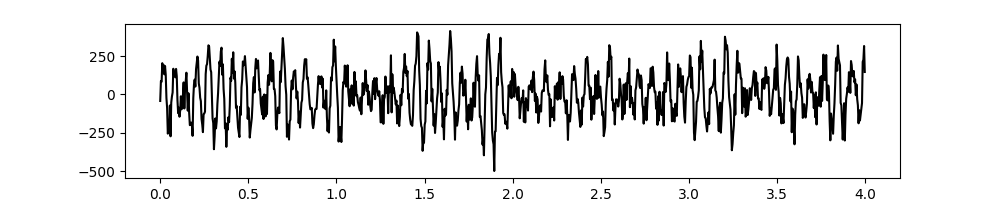
Firstly we will import emd and simulate a signal
import emd
import numpy as np
import matplotlib.pyplot as plt
from scipy import ndimage

# Define and simulate a simple signal
peak_freq = 15
sample_rate = 256
seconds = 10
noise_std = .4
x = emd.utils.ar_simulate(peak_freq, sample_rate, seconds,
                          noise_std=noise_std, random_seed=42, r=.96)[:, 0]
t = np.linspace(0, seconds, seconds*sample_rate)

# Plot the first 5 seconds of data
plt.figure(figsize=(10, 2))
plt.plot(t[:sample_rate*4], x[:sample_rate*4], 'k')

# sphinx_gallery_thumbnail_number = 5
Out:
[<matplotlib.lines.Line2D object at 0x7f6e5a9d7e90>]
Extract IMFs & find cycles
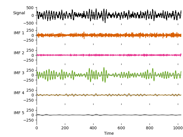
We next run a mask sift with the default parameters to isolate the 15Hz oscillation. There is only one clear oscillatory signal in this simulation. This is extracted in IMF-3 whilst the remaining IMFs contain low-amplitude noise.
# Run a mask sift
imf = emd.sift.mask_sift(x, max_imfs=5)

# Visualise the IMFs
emd.plotting.plot_imfs(imf[:sample_rate*4, :], cmap=True, scale_y=True)
Next we locate the cycle indices from the instantaneous phase of our IMFs. We do this twice, once to identify all cycles and a second time to identify only ‘good’ cycles based on the cycle validation check from the previous tutorial.
# Extract frequency information
IP, IF, IA = emd.spectra.frequency_transform(imf, sample_rate, 'nht')

# Extract cycle locations
all_cycles = emd.cycles.get_cycle_vector(IP, return_good=False)
good_cycles = emd.cycles.get_cycle_vector(IP, return_good=True)
We can customise the parts of the signal in which we look for cycles by defining a mask. This is a binary vector indicating which samples in a time-series should be included in the cycle detection. This could be useful for several reasons, we can mask our sections of signal with artefacts, limit cycle detection to a specific period during a task or limit cycle detection to periods where there is a high amplitude oscillation.
Here we will apply a low amplitude threshold to identify good cycles which have amplitude values strictly above the 33th percentile of amplitude values in the dataset - excluding the lowest amplitude cycles.
Note that the whole cycle must be in the valid part of the mask to be included, a cycle will be excluded if a single sample within it is masked out.
thresh = np.percentile(IA[:, 2], 33)
mask = IA[:, 2] > thresh

mask_cycles = emd.cycles.get_cycle_vector(IP, return_good=True, mask=mask)
We can compute a variety of metric from our cycles using the
emd.cycles.get_cycle_stat function. This is a simple helper function
which takes in a set of cycle timings (the output from
emd.cycles.get_cycle_vector) and any time-series of interest (such as
instaneous amplitude or frequency). The function then computes a metric from
the time-series within each cycle.
The computed metric is defined by the func argument, this can be any
function which takes a vector input and returns a single-number. Often we will
use se the numpy built-in functions to compute simple metrics (such as
np.max or np.mean) but we can use a custom user-defined function as
well.
Finally we can define whether to return the result in full or
compressed format. The full form returns a vector of the same length as the
input vector in which the indices for each cycle contains the its cycle-stat
whilst, the compressed form returns a vector containing single values
for each cycle in turn.
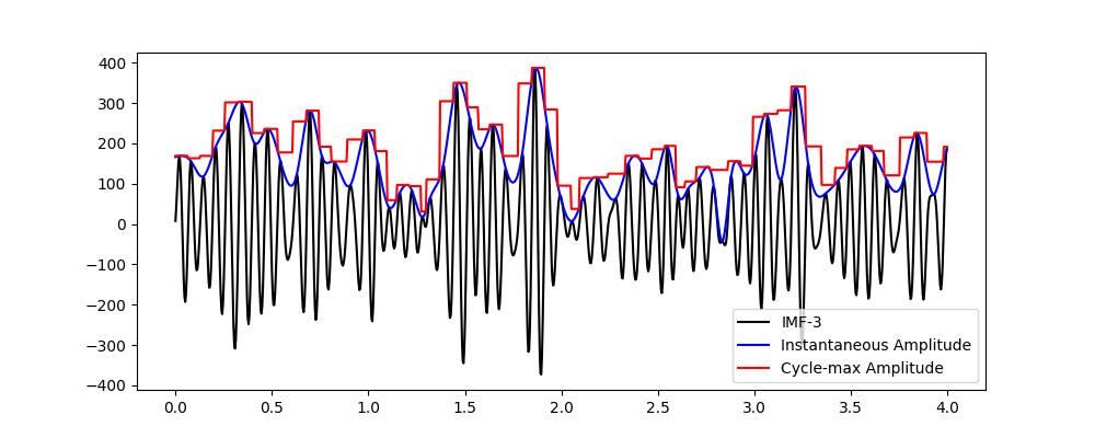
For instance, the following example computes the maximum instantaneous amplitude for all detected cycles in IMF-3 and returns the result in the full-vector format.
cycle_amp = emd.cycles.get_cycle_stat(all_cycles[:, 2], IA[:, 2], out='samples', func=np.max)

# Make a summary figure
plt.figure(figsize=(10, 4))
plt.plot(t[:sample_rate*4], imf[:sample_rate*4, 2], 'k')
plt.plot(t[:sample_rate*4], IA[:sample_rate*4, 2], 'b')
plt.plot(t[:sample_rate*4], cycle_amp[:sample_rate*4], 'r')
plt.legend(['IMF-3', 'Instantaneous Amplitude', 'Cycle-max Amplitude'])
Out:
<matplotlib.legend.Legend object at 0x7f6e5aa5d8d0>
We can see that the original IMF in black and its instantaneous amplitude in blue. The red line is then the full-format output containing the cycle maximum amplitude. This nicely corresponds to the peak amplitude for each cycle as seen in blue.
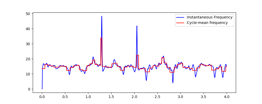
The next section computes the average instantaneous frequency within each cycle, again returning the result in full format.
cycle_freq = emd.cycles.get_cycle_stat(all_cycles[:, 2], IF[:, 2], out='samples', func=np.mean)

# Make a summary figure
plt.figure(figsize=(10, 4))
plt.plot(t[:sample_rate*4], IF[:sample_rate*4, 2], 'b')
plt.plot(t[:sample_rate*4], cycle_freq[:sample_rate*4], 'r')
plt.legend(['Instantaneous Frequency', 'Cycle-mean frequency'])
Out:
<matplotlib.legend.Legend object at 0x7f6e5aa59bd0>
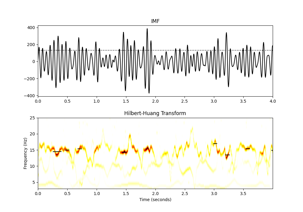
We can get a nice visualisation of cycle-average frequency by overlaying the full stat vector onto the Hilbert-Huang transform. This is similar to the plot above but now we can see the signal amplitude values in the colour-scale of the HHT (hotter colours show higher amplitudes). Here we plot the cycle-average frequency for cycles above our amplitude thresholdover the HHT
# Compute cycle freq using amplitude masked-cycle indices
cycle_freq = emd.cycles.get_cycle_stat(mask_cycles[:, 2], IF[:, 2], out='samples', func=np.mean)

# Carrier frequency histogram definition
freq_range = (3, 25, 64)

# Compute the 2d Hilbert-Huang transform (power over time x carrier frequency)
f, hht = emd.spectra.hilberthuang(IF, IA, freq_range, mode='amplitude', sum_time=False)

# Add a little smoothing to help visualisation
shht = ndimage.gaussian_filter(hht, 1)

# Make a summary plot
plt.figure(figsize=(10, 7))
plt.subplots_adjust(hspace=.3)
plt.subplot(211)
plt.plot(t[:sample_rate*4], imf[:sample_rate*4, 2], 'k')
plt.plot((0, 4), (thresh, thresh), 'k:')
plt.xlim(0, 4)
plt.title('IMF')
plt.subplot(212)
plt.pcolormesh(t[:sample_rate*4], f, shht[:, :sample_rate*4], cmap='hot_r', vmin=0)
plt.plot(t[:sample_rate*4], cycle_freq[:sample_rate*4], 'k')
plt.title('Hilbert-Huang Transform')
plt.xlabel('Time (seconds)')
plt.ylabel('Frequency (Hz)')
Out:
Text(92.09722222222221, 0.5, 'Frequency (Hz)')
Compressed cycle stats
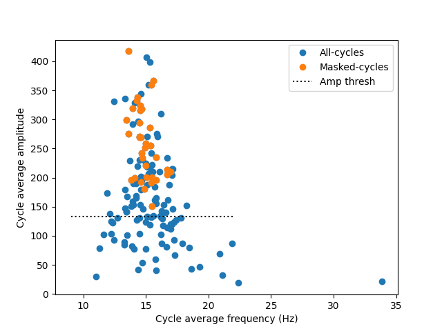
The full-format output is useful for visualisation and validation, but often we only want to deal with a single number summarising each cycle. The compressed format provides this simplified output. Note that the first value of the compressed format contains the average for missing cycles in the analysis (where the value in the cycles vector equals zero) we will discard this for the following analyses as we are focusing on the properties of well formed oscillatory cycles.
For a first example, we compute the average frequency and amplitude of all cycles. We then make a scatter plot to explore any relationship between amplitude and frequency.
# Compute cycle average frequency for all cycles and masked cycles
all_cycle_freq = emd.cycles.get_cycle_stat(all_cycles[:, 2], IF[:, 2], func=np.mean)
mask_cycle_freq = emd.cycles.get_cycle_stat(mask_cycles[:, 2], IF[:, 2], func=np.mean)

# Compute cycle frequency range for all cycles and for masked cycles
all_cycle_amp = emd.cycles.get_cycle_stat(all_cycles[:, 2], IA[:, 2], func=np.mean)
mask_cycle_amp = emd.cycles.get_cycle_stat(mask_cycles[:, 2], IA[:, 2], func=np.mean)

# Make a summary figures
plt.figure()
plt.plot(all_cycle_freq, all_cycle_amp, 'o')
plt.plot(mask_cycle_freq, mask_cycle_amp, 'o')
plt.xlabel('Cycle average frequency (Hz)')
plt.ylabel('Cycle average amplitude')
plt.plot((9, 22), (thresh, thresh), 'k:')
plt.legend(['All-cycles', 'Masked-cycles', 'Amp thresh'])
Out:
<matplotlib.legend.Legend object at 0x7f6e5b72afd0>
We see that high amplitude cycles are closely clustered around 15Hz - the peak frequency of our simulated oscillation. Lower amplitude cycles are noisier and have a wider frequency distribution. The rejected bad-cycles tend to have low amplitudes and come from a wide frequency distribution.
A small number of cycles pass the amplitude threshold but are rejected by the
cycle quality checks. These cycles may have phase distortions or other
artefacts which have lead to emd.cycles.get_cycle_vector to remove them
from the set of good cycles.
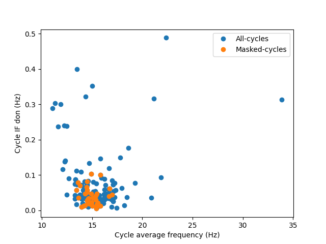
We can include more complex user-defined functions to generate cycle stats. Here we compute a range of cycle stats in compressed format (discarding the first value in the output). We compute the cycle average frequency and cycle-max amplitude for all cycles and again for only the good cycles. We can then make a scatter plot to explore any relationship between amplitude and frequency.
We can include more complicated metrics in user-specified functions. Here we compute the Degree of Non-linearity (DoN; https://doi.org/10.1371/journal.pone.0168108) of each cycle as an indication of the extent to which a cycle contains non-sinudoisal content.
Note that the original DoN uses the zero-crossing frequency rather than mean frequency as a normalising factor. These factors are highly correlated so, for simplicity, we use the mean here.
Here we compute the degree of non-linearity for all cycles and good cycles separately and plot the results as a function of cycle average frequency
# Compute cycle average frequency for all cycles and masked cycles
all_cycle_freq = emd.cycles.get_cycle_stat(all_cycles[:, 2], IF[:, 2], func=np.mean)
mask_cycle_freq = emd.cycles.get_cycle_stat(mask_cycles[:, 2], IF[:, 2], func=np.mean)


# Define a simple function to compute the range of a set of values
def degree_nonlinearity(x):
    return np.std((x - x.mean()) / x.mean())


# Compute cycle freuquency range for all cycles and for masked cycles
all_cycle_freq_don = emd.cycles.get_cycle_stat(all_cycles[:, 2], IF[:, 2],
                                               func=degree_nonlinearity)
cycle_freq_don = emd.cycles.get_cycle_stat(mask_cycles[:, 2], IF[:, 2],
                                           func=degree_nonlinearity)

# Make a summary figures
plt.figure()
plt.plot(all_cycle_freq, all_cycle_freq_don, 'o')
plt.plot(mask_cycle_freq, cycle_freq_don, 'o')
plt.xlabel('Cycle average frequency (Hz)')
plt.ylabel('Cycle IF don (Hz)')
plt.legend(['All-cycles', 'Masked-cycles'])
Out:
<matplotlib.legend.Legend object at 0x7f6e5a98a890>
The majority of cycles with very high degree of non-linearity in this simulation have been rejected by either the amplitude threshold or the cycle quality checks. The surviving cycles (in orange) are tightly clustered around 15Hz peak frequency with a relatively low degree of non-linearity. We have not defined any non-linearity in this simulation.
Total running time of the script: ( 0 minutes 1.501 seconds)