Note
Click here to download the full example code
The Hilbert-Huang Transform
The Hilbert-Huang transform provides a description of how the energy or power within a signal is distributed across frequency. The distributions are based on the instantaneous frequency and amplitude of a signal.
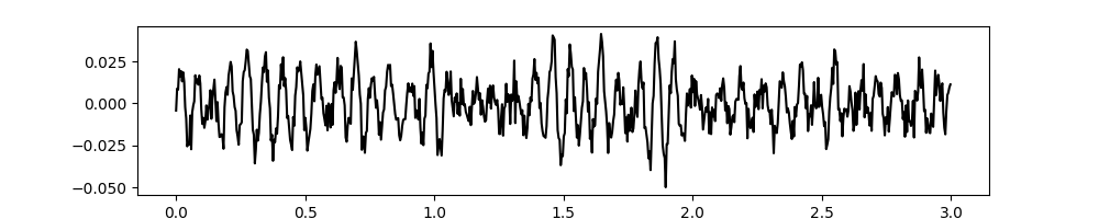
To get started, lets simulate a noisy signal with a 15Hz oscillation.
import emd
import numpy as np
from scipy import ndimage

import matplotlib.pyplot as plt
import matplotlib.patches as patches

# Define and simulate a simple signal
peak_freq = 15
sample_rate = 256
seconds = 10
noise_std = .4
x = emd.utils.ar_simulate(peak_freq, sample_rate, seconds,
                          noise_std=noise_std, random_seed=42, r=.96)[:, 0]
x = x*1e-4
t = np.linspace(0, seconds, seconds*sample_rate)

# sphinx_gallery_thumbnail_number = 6


# Plot the first 5 seconds of data
plt.figure(figsize=(10, 2))
plt.plot(t[:sample_rate*3], x[:sample_rate*3], 'k')
Out:
[<matplotlib.lines.Line2D object at 0x7f9da4ec4990>]
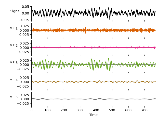
We then extract the IMFs using a mask sift with the default options
# Run a mask sift
imf = emd.sift.mask_sift(x, max_imfs=5)

emd.plotting.plot_imfs(imf[:sample_rate*3, :], cmap=True, scale_y=True)
1d frequency transform
Next we use emd.spectra.frequency_transform to compute the frequency content
of the IMFs. This function returns the instantaneous phase, frequency and
amplitude of each IMF. It takes a set of intrinsic mode functions, the sample
rate and a mode as input arguments. The mode determines the algorithm which
is used to compute the frequency transform, several are available but in this
case we use nht which specifies the Normalised-Hilbert Transform. This is
a good general purpose choice which should work well in most circumstances.
# Compute frequency statistics
IP, IF, IA = emd.spectra.frequency_transform(imf, sample_rate, 'nht')
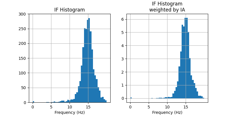
The Hilbert-Huang transform can be thought of as an amplitude-weighted histogram of the instantaneous-frequency values from an IMF. The next sections break this down into parts.
To get started, we can plot a simple histogram of IF values using matplotlibs
built-in hist function. We do this twice, once as a standard count and
once by weighting the observations by their amplitude.
We will concentrate on IMF-3 from now as it contains our 15Hz oscillation.
plt.figure(figsize=(8, 4))

plt.subplot(121)
# Plot a simple histogram using frequency bins from 0-20Hz
plt.hist(IF[:, 2], np.linspace(0, 20))
plt.grid(True)
plt.title('IF Histogram')
plt.xticks(np.arange(0, 20, 5))
plt.xlabel('Frequency (Hz)')

plt.subplot(122)
# Plot an amplitude-weighted histogram using frequency bins from 0-20Hz
plt.hist(IF[:, 2], np.linspace(0, 20), weights=IA[:, 2])
plt.grid(True)
plt.title('IF Histogram\nweighted by IA')
plt.xticks(np.arange(0, 20, 5))
plt.xlabel('Frequency (Hz)')
Out:
Text(0.5, 14.722222222222216, 'Frequency (Hz)')
In this case our two distributions are pretty similar. Both are centred around 15Hz (as we would expect) and both have tails stretching between about 6-18Hz. These tails are smaller in the amplitude-weighted histogram on the right, suggesting that these outlying frequency values tend to occur at time points with very low amplitude.
The EMD toolbox provides a few functions to compute a few variants of the
Hilbert-Huang transform. The first step is to define the frequency bins to
use in the histogram with emd.spectra.define_hist_bins. This takes a
minimum frequency, maximum frequency and number of frequency steps as the
main arguments and returns arrays containing the edges and centres of the
defined bins.
Lets take a look at a couple of examples, first we define 4 bins between 1 and 5Hz
freq_edges, freq_centres = emd.spectra.define_hist_bins(1, 5, 4)
print('Bin Edges:   {0}'.format(freq_edges))
print('Bin Centres: {0}'.format(freq_centres))
Out:
Bin Edges:   [1. 2. 3. 4. 5.]
Bin Centres: [1.5 2.5 3.5 4.5]
This returns 5 bin edges and 4 bin centres which we can use to create and plot our Hilbert-Huang transform. This choice of frequency bin size defines the resolution of transform and is free to be tuned to the application at hand.
Several other options are available. For instance, we can specify a log bin spacing between 1 and 50Hz (the default option is a uniform linear spacing).
freq_edges, freq_centres = emd.spectra.define_hist_bins(1, 50, 8, 'log')

# We round the values to 3dp for easier visualisation
print('Bin Edges:   {0}'.format(np.round(freq_edges, 3)))
print('Bin Centres: {0}'.format(np.round(freq_centres, 3)))
Out:
Bin Edges:   [ 1.     1.631  2.659  4.336  7.071 11.531 18.803 30.662 50.   ]
Bin Centres: [ 1.315  2.145  3.498  5.704  9.301 15.167 24.732 40.331]
The frequency bin edges are used to compute the Hilbert-Huang transforms.
These are passed in as the third argument to emd.spectra.hilberthuang.
The histogram bin centres are returned alongside the HHT.
freq_edges, freq_centres = emd.spectra.define_hist_bins(1, 50, 8, 'log')
f, spectrum = emd.spectra.hilberthuang(IF, IA, freq_edges)
Out:
[ 1.          1.63068941  2.65914795  4.3362444   7.07106781 11.53071539
 18.80301547 30.66187818 50.        ]
As a shorthand, we can also pass in a tuple of values specifying the low frequency, high frequeny and number of steps. The HHT will then compute the histogram edges internally.
f, spectrum = emd.spectra.hilberthuang(IF, IA, (1, 50, 25))
Once we have our frequency bins defined, we can compute the Hilbert-Huang
transform. The simplest HHT is computed by emd.spectra.hilberthuang_1d.
This returns a vector containing the weighted histograms for each IMF within
the bins specified by edges
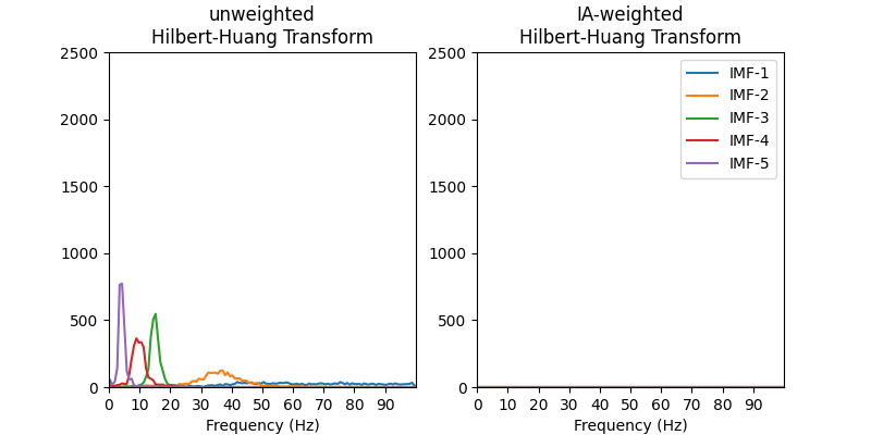
Here, we defined a set of linear bins between 0 and 100Hz and compute both a weighted and unweighed HHT.
freq_edges, freq_centres = emd.spectra.define_hist_bins(0, 100, 128, 'linear')

# Amplitude weighted HHT per IMF
f, spec_weighted = emd.spectra.hilberthuang(IF, IA, freq_edges, sum_imfs=False)

# Unweighted HHT per IMF - we replace the instantaneous amplitude values with ones
f, spec_unweighted = emd.spectra.hilberthuang(IF, np.ones_like(IA), freq_edges, sum_imfs=False)
Out:
[  0.        0.78125   1.5625    2.34375   3.125     3.90625   4.6875
   5.46875   6.25      7.03125   7.8125    8.59375   9.375    10.15625
  10.9375   11.71875  12.5      13.28125  14.0625   14.84375  15.625
  16.40625  17.1875   17.96875  18.75     19.53125  20.3125   21.09375
  21.875    22.65625  23.4375   24.21875  25.       25.78125  26.5625
  27.34375  28.125    28.90625  29.6875   30.46875  31.25     32.03125
  32.8125   33.59375  34.375    35.15625  35.9375   36.71875  37.5
  38.28125  39.0625   39.84375  40.625    41.40625  42.1875   42.96875
  43.75     44.53125  45.3125   46.09375  46.875    47.65625  48.4375
  49.21875  50.       50.78125  51.5625   52.34375  53.125    53.90625
  54.6875   55.46875  56.25     57.03125  57.8125   58.59375  59.375
  60.15625  60.9375   61.71875  62.5      63.28125  64.0625   64.84375
  65.625    66.40625  67.1875   67.96875  68.75     69.53125  70.3125
  71.09375  71.875    72.65625  73.4375   74.21875  75.       75.78125
  76.5625   77.34375  78.125    78.90625  79.6875   80.46875  81.25
  82.03125  82.8125   83.59375  84.375    85.15625  85.9375   86.71875
  87.5      88.28125  89.0625   89.84375  90.625    91.40625  92.1875
  92.96875  93.75     94.53125  95.3125   96.09375  96.875    97.65625
  98.4375   99.21875 100.     ]
We can visualise these distributions by plotting the HHT across frequencies. Note that though we use the freq_edges to define the histogram, we visualise it by plotting the value for each bin at its centre frequency.
plt.figure(figsize=(8, 4))
plt.subplot(121)
plt.plot(freq_centres, spec_unweighted)
plt.xticks(np.arange(10)*10)
plt.xlim(0, 100)
plt.ylim(0, 2500)
plt.xlabel('Frequency (Hz)')
plt.title('unweighted\nHilbert-Huang Transform')

plt.subplot(122)
plt.plot(freq_centres, spec_weighted)
plt.xticks(np.arange(10)*10)
plt.xlim(0, 100)
plt.ylim(0, 2500)
plt.xlabel('Frequency (Hz)')
plt.title('IA-weighted\nHilbert-Huang Transform')
plt.legend(['IMF-1', 'IMF-2', 'IMF-3', 'IMF-4', 'IMF-5'])
Out:
<matplotlib.legend.Legend object at 0x7f9da4744c90>
The frequency content of all IMFs are visible in the unweighted HHT. We can see that each IMF contains successively slower dynamics and that the high frequency IMFs tend to have wider frequency distributions.
All but IMF-3 are greatly reduced in the weighted HHT. This tells us that the frequency content in the other IMFs occurred at relatively low power - as we would expect from our simulated 15Hz signal.
2d time-frequency transform
The Hilbert-Huang transform can also be computed across time to explore any dynamics in instantaneous frequency. This is conceptually very similar to the 1d HHT, we compute a weighted histogram of instantaneous frequency values except now we compute a separate histogram for each time-point.
As before, we start by defining the frequency bins. The time bins are taken
at the sample rate of the data. The 2d frequency transform is computed by
emd.spectra.hilberthuang
# Carrier frequency histogram definition
freq_edges, freq_centres = emd.spectra.define_hist_bins(1, 25, 24, 'linear')

f, hht = emd.spectra.hilberthuang(IF[:, 2, None], IA[:, 2, None], freq_edges, mode='amplitude', sum_time=False)
time_centres = np.arange(201)-.5
Out:
[ 1.  2.  3.  4.  5.  6.  7.  8.  9. 10. 11. 12. 13. 14. 15. 16. 17. 18.
 19. 20. 21. 22. 23. 24. 25.]
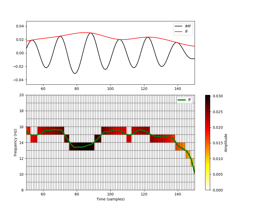
We can visualise what the Hilbert-Huang transform is doing in 2d by plotting the HHT and IF on the same plot. Here we zoom into a short segment of the simulation and plot the IMF-3 time course and instantaneous amplitude values in the top panel.
The bottom panel shows a grid cast across a set of time-frequency axes. The time steps are defined by the sample rate of the data and the frequency steps are defined by our histogram bins above. We plot both the HHT and the IF on these axes.
plt.figure(figsize=(10, 8))
# Add signal and IA
plt.axes([.1, .6, .64, .3])
plt.plot(imf[:, 2], 'k')
plt.plot(IA[:, 2], 'r')
plt.legend(['IMF', 'IF'])
plt.xlim(50, 150)

# Add IF axis and legend
plt.axes([.1, .1, .8, .45])
plt.plot(IF[:, 2], 'g', linewidth=3)
plt.legend(['IF'])

# Plot HHT
plt.pcolormesh(time_centres, freq_edges, hht[:, :200], cmap='hot_r', vmin=0)

# Set colourbar
cb = plt.colorbar()
cb.set_label('Amplitude', rotation=90)

# Add some grid lines
for ii in range(len(freq_edges)):
    plt.plot((0, 200), (freq_edges[ii], freq_edges[ii]), 'k', linewidth=.5)
for ii in range(200):
    plt.plot((ii, ii), (0, 20), 'k', linewidth=.5)

# Overlay the IF again for better visualisation
plt.plot(IF[:, 2], 'g', linewidth=3)

# Set lims and labels
plt.xlim(50, 150)
plt.ylim(8, 20)
plt.xlabel('Time (samples)')
plt.ylabel('Frequency (Hz)')
Out:
Text(66.97222222222221, 0.5, 'Frequency (Hz)')
The green line in the bottom panel is the instantaneous frequency of IMF-3. At each point in time, we determine which frequency bin the instantaneous frequency is within and place the corresponding instantaneous amplitude into that cell of the HHT.
This is effectively quatising (or digitising) the instantaneous frequency values within our defined frequnecy bins. We can only see frequency dynamics in the HHT when the IF crosses between the edges of the frequency bins. Though this reduces our frequency resolution a little, it means that we can easly visualise the amplitude and frequency information together in the same plot.
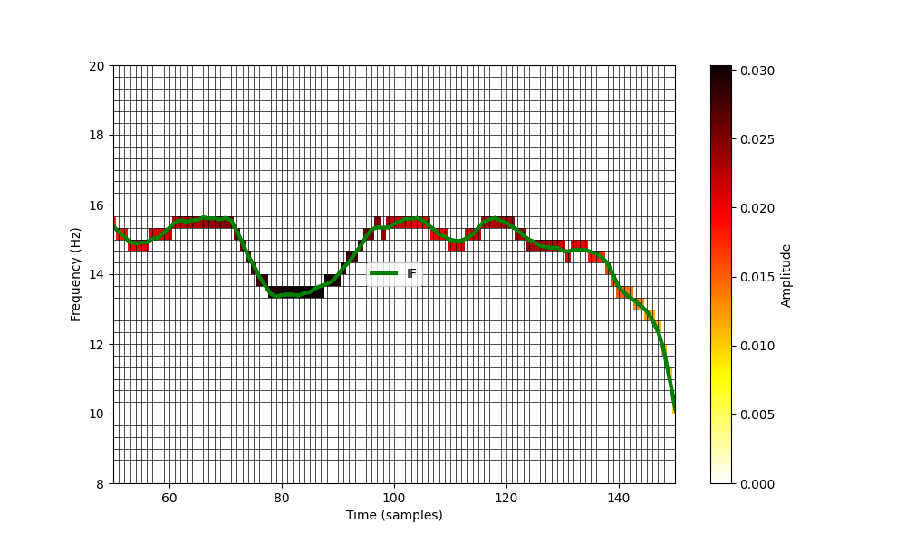
If we want a higher frequency resolution, we can simply increase the number
of frequency bins when defining the histogram parameters in
emd.spectra.define_hist_bins. Here, we repeat our plot using three times
more bins.
# Carrier frequency histogram definition
freq_edges, freq_centres = emd.spectra.define_hist_bins(1, 25, 24*3, 'linear')

f, hht = emd.spectra.hilberthuang(IF[:, 2], IA[:, 2], freq_edges, mode='amplitude', sum_time=False)
time_centres = np.arange(201)-.5

# Create summary figure

plt.figure(figsize=(10, 6))
plt.plot(IF[:, 2], 'g', linewidth=3)
plt.legend(['IF'])

# Plot HHT
plt.pcolormesh(time_centres, freq_edges, hht[:, :200], cmap='hot_r', vmin=0)

# Set colourbar
cb = plt.colorbar()
cb.set_label('Amplitude', rotation=90)

# Add some grid lines
for ii in range(len(freq_edges)):
    plt.plot((0, 200), (freq_edges[ii], freq_edges[ii]), 'k', linewidth=.5)
for ii in range(200):
    plt.plot((ii, ii), (0, 20), 'k', linewidth=.5)

# Overlay the IF again for better visualisation
plt.plot(IF[:, 2], 'g', linewidth=3)

# Set lims and labels
plt.xlim(50, 150)
plt.ylim(8, 20)
plt.xlabel('Time (samples)')
plt.ylabel('Frequency (Hz)')
Out:
[ 1.          1.33333333  1.66666667  2.          2.33333333  2.66666667
  3.          3.33333333  3.66666667  4.          4.33333333  4.66666667
  5.          5.33333333  5.66666667  6.          6.33333333  6.66666667
  7.          7.33333333  7.66666667  8.          8.33333333  8.66666667
  9.          9.33333333  9.66666667 10.         10.33333333 10.66666667
 11.         11.33333333 11.66666667 12.         12.33333333 12.66666667
 13.         13.33333333 13.66666667 14.         14.33333333 14.66666667
 15.         15.33333333 15.66666667 16.         16.33333333 16.66666667
 17.         17.33333333 17.66666667 18.         18.33333333 18.66666667
 19.         19.33333333 19.66666667 20.         20.33333333 20.66666667
 21.         21.33333333 21.66666667 22.         22.33333333 22.66666667
 23.         23.33333333 23.66666667 24.         24.33333333 24.66666667
 25.        ]

Text(91.97222222222221, 0.5, 'Frequency (Hz)')
This greatly increases the frequency-resolution in the y-axis. This can be tuned to meet your needs depending on the analysis in-hand and computational demands. A Hilbert-Huang Transform of a long time-series with very high frequency resolution can create a very large matrix….
Similarly, we could specify a log-frequency scale by changing the definition
in emd.spectra.define_hist_bins
# Carrier frequency histogram definition
freq_edges, freq_centres = emd.spectra.define_hist_bins(1, 25, 24, 'log')

f, hht = emd.spectra.hilberthuang(IF[:, 2], IA[:, 2], freq_edges, mode='amplitude', sum_time=False)
time_centres = np.arange(201)-.5

plt.figure(figsize=(10, 6))
plt.plot(IF[:, 2], 'g', linewidth=3)
plt.legend(['IF'])

# Plot HHT
plt.pcolormesh(time_centres, freq_edges, hht[:, :200], cmap='hot_r', vmin=0)

# Set colourbar
cb = plt.colorbar()
cb.set_label('Amplitude', rotation=90)

# Add some grid lines
for ii in range(len(freq_edges)):
    plt.plot((0, 200), (freq_edges[ii], freq_edges[ii]), 'k', linewidth=.5)
for ii in range(200):
    plt.plot((ii, ii), (0, 20), 'k', linewidth=.5)

# Overlay the IF again for better visualisation
plt.plot(IF[:, 2], 'g', linewidth=3)

# Set lims and labels
plt.xlim(50, 150)
plt.ylim(1, 20)
plt.xlabel('Time (samples)')
plt.ylabel('Frequency (Hz)')
Out:
[ 1.          1.14352984  1.30766049  1.49534878  1.70997595  1.95540851
  2.23606798  2.55701045  2.92401774  3.34370152  3.82362246  4.37242636
  5.          5.71764918  6.53830243  7.47674391  8.54987973  9.77704257
 11.18033989 12.78505224 14.62008869 16.71850762 19.11811228 21.86213181
 25.        ]

Text(78.97222222222221, 0.5, 'Frequency (Hz)')
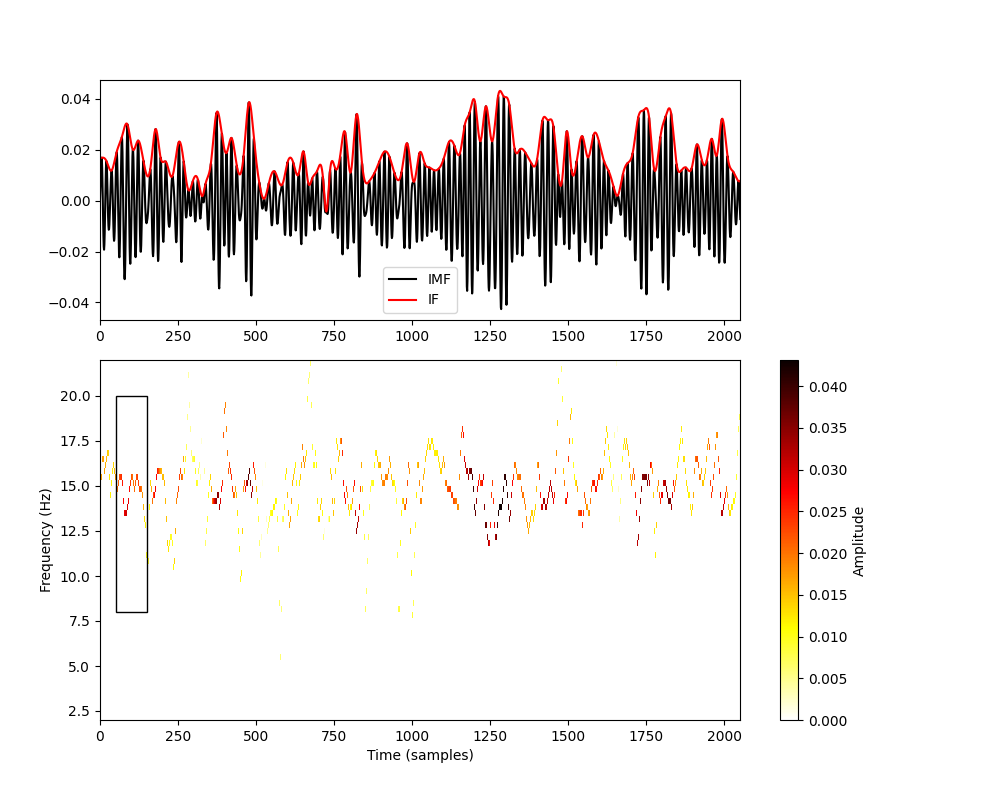
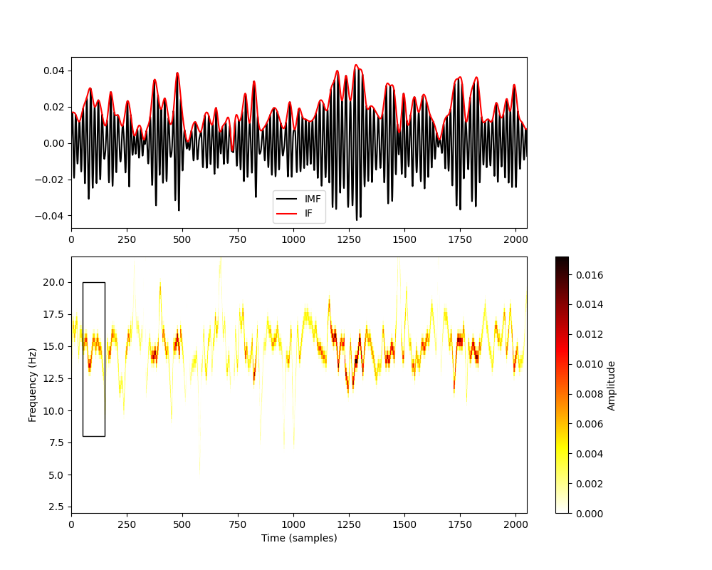
Let us zoom back out to a longer section of our simulated time series. Here we plot the IMF, IA and HHT across around 4 seconds of data. We use a relatively high resolution set of frequency bins with a linear spacing.
# Carrier frequency histogram definition
freq_edges, freq_centres = emd.spectra.define_hist_bins(1, 25, 24*3, 'linear')

f, hht = emd.spectra.hilberthuang(IF[:, 2], IA[:, 2], freq_edges, mode='amplitude', sum_time=False)
time_centres = np.arange(2051)-.5

plt.figure(figsize=(10, 8))
# Add signal and IA
plt.axes([.1, .6, .64, .3])
plt.plot(imf[:, 2], 'k')
plt.plot(IA[:, 2], 'r')
plt.legend(['IMF', 'IF'])
plt.xlim(0, 2050)

# Add IF axis and legend
plt.axes([.1, .1, .8, .45])

# Plot HHT
plt.pcolormesh(time_centres, freq_edges, hht[:, :2050], cmap='hot_r', vmin=0)

# Set colourbar
cb = plt.colorbar()
cb.set_label('Amplitude', rotation=90)

# Set lims and labels
plt.xlim(0, 2050)
plt.ylim(2, 22)
plt.xlabel('Time (samples)')
plt.ylabel('Frequency (Hz)')

rect = patches.Rectangle((50, 8), 100, 12, edgecolor='k', facecolor='none')
plt.gca().add_patch(rect)
Out:
[ 1.          1.33333333  1.66666667  2.          2.33333333  2.66666667
  3.          3.33333333  3.66666667  4.          4.33333333  4.66666667
  5.          5.33333333  5.66666667  6.          6.33333333  6.66666667
  7.          7.33333333  7.66666667  8.          8.33333333  8.66666667
  9.          9.33333333  9.66666667 10.         10.33333333 10.66666667
 11.         11.33333333 11.66666667 12.         12.33333333 12.66666667
 13.         13.33333333 13.66666667 14.         14.33333333 14.66666667
 15.         15.33333333 15.66666667 16.         16.33333333 16.66666667
 17.         17.33333333 17.66666667 18.         18.33333333 18.66666667
 19.         19.33333333 19.66666667 20.         20.33333333 20.66666667
 21.         21.33333333 21.66666667 22.         22.33333333 22.66666667
 23.         23.33333333 23.66666667 24.         24.33333333 24.66666667
 25.        ]

<matplotlib.patches.Rectangle object at 0x7f9d9ca90e50>
Note that the colour map in the bottom panel carefully tracks the instantaneous amplitude (top-panel in red) of the IMF at the full sample rate of the data. When there is a high amplitude, we can see rapid changes in instantaneous frequency - even within single cycles of the 15Hz oscillation.
The black rectangle in the lower panel shows the part of the signal that we were visualising above.
Sometimes the binning in the Hilbert-Huang Transform can make the signal
appear discontinuous. To reduce this effect we can apply a small amount of
smoothing to the HHT image. Here we repeat the figure above to plot a
smoothed HHT. We use a gaussian image filter from the scipy.ndimage
toolbox for the smoothing.
# Carrier frequency histogram definition
freq_edges, freq_centres = emd.spectra.define_hist_bins(1, 25, 24*3, 'linear')

f, hht = emd.spectra.hilberthuang(IF[:, 2], IA[:, 2], freq_edges, mode='amplitude', sum_time=False)
time_centres = np.arange(2051)-.5

# Apply smoothing
hht = ndimage.gaussian_filter(hht, 1)

plt.figure(figsize=(10, 8))
# Add signal and IA
plt.axes([.1, .6, .64, .3])
plt.plot(imf[:, 2], 'k')
plt.plot(IA[:, 2], 'r')
plt.legend(['IMF', 'IF'])
plt.xlim(0, 2050)

# Add IF axis and legend
plt.axes([.1, .1, .8, .45])

# Plot HHT
plt.pcolormesh(time_centres, freq_edges, hht[:, :2050], cmap='hot_r', vmin=0)

# Set colourbar
cb = plt.colorbar()
cb.set_label('Amplitude', rotation=90)

# Set lims and labels
plt.xlim(0, 2050)
plt.ylim(2, 22)
plt.xlabel('Time (samples)')
plt.ylabel('Frequency (Hz)')

rect = patches.Rectangle((50, 8), 100, 12, edgecolor='k', facecolor='none')
plt.gca().add_patch(rect)
Out:
[ 1.          1.33333333  1.66666667  2.          2.33333333  2.66666667
  3.          3.33333333  3.66666667  4.          4.33333333  4.66666667
  5.          5.33333333  5.66666667  6.          6.33333333  6.66666667
  7.          7.33333333  7.66666667  8.          8.33333333  8.66666667
  9.          9.33333333  9.66666667 10.         10.33333333 10.66666667
 11.         11.33333333 11.66666667 12.         12.33333333 12.66666667
 13.         13.33333333 13.66666667 14.         14.33333333 14.66666667
 15.         15.33333333 15.66666667 16.         16.33333333 16.66666667
 17.         17.33333333 17.66666667 18.         18.33333333 18.66666667
 19.         19.33333333 19.66666667 20.         20.33333333 20.66666667
 21.         21.33333333 21.66666667 22.         22.33333333 22.66666667
 23.         23.33333333 23.66666667 24.         24.33333333 24.66666667
 25.        ]

<matplotlib.patches.Rectangle object at 0x7f9d9c90cdd0>
This smoothing step often makes the HHT image easier to read and interpret.
Making Hilbert-Huang Transform Plots
Finally, we include a helper function for plotting Hilbert-Huang transforms -
emd.plotting.plot_hilberthuang. This takes a HHT matrix, and
corresponding time and frequency vector as inputs and procudes a configurable
plot. For example:
emd.plotting.plot_hilberthuang(hht, time_centres, freq_centres)
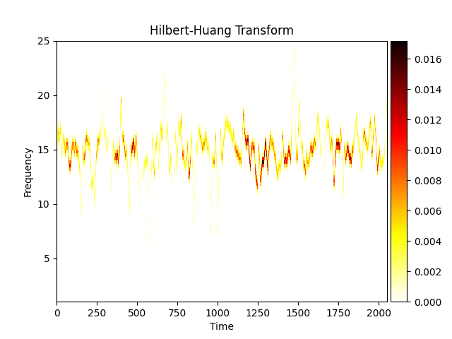
Out:
<AxesSubplot:title={'center':'Hilbert-Huang Transform'}, xlabel='Time', ylabel='Frequency'>
This function is highly configurable - a full list of options can be found in the function docstring. Here we change the colourmap, set the y-axis to a log scale and zoom into a specified time-range.
emd.plotting.plot_hilberthuang(hht, time_centres, freq_centres,
                               cmap='viridis', time_lims=(750, 1500),  log_y=True)
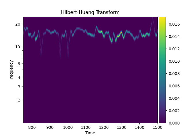
Out:
<AxesSubplot:title={'center':'Hilbert-Huang Transform'}, xlabel='Time', ylabel='Frequency'>
Total running time of the script: ( 0 minutes 4.288 seconds)